

Contrast Trim: Subtle and Statement Looks
I’m about to be deep in the throes of decision-making for the Austin Tudor. As we wait to officially close on the house, I’m considering initial design plans, including building out my Pinterest boards with inspiration from every corner of the internet. Throughout this creation direction process, I’ve been finding myself gravitating towards so many examples of contrast trim.
Over the past year two, I’ve noticed designers really shifting away from the classic white trim look in favor of something fresh like contrast trim. Sometimes it’s incredibly subtle with a soft gray or taupe, and other times it’s a statement with deep charcoal or blue. Contrast trim can be done a million different ways, and I wanted to share a few of some personal favorites. Who knows, maybe I’ll even take the plunge myself.
My Inspiration for Contrast Trim
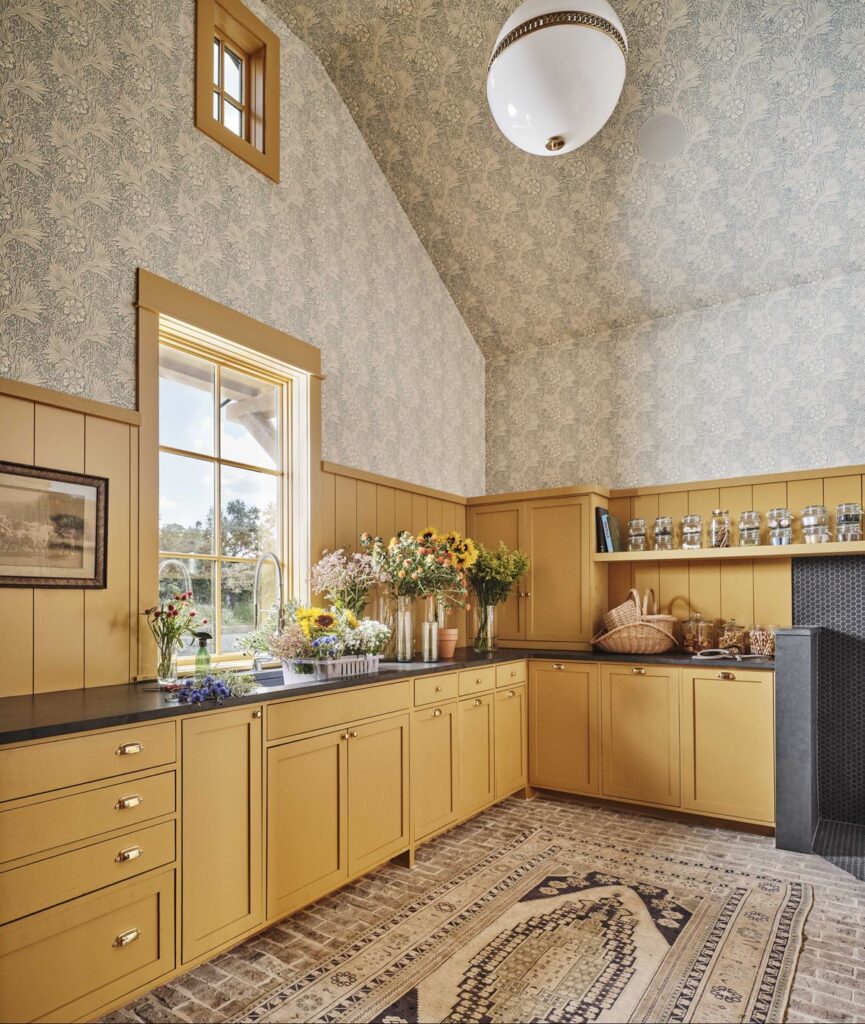
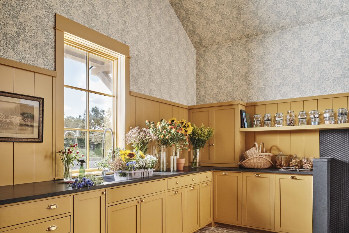
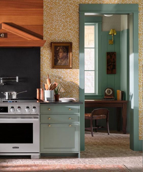
Design: Sabbe Interior Design | Photography: Lisa Petrole
Nashville-based Stephanie Sabbe has a knack for bringing loads of character to any space she touches. I’ve been obsessed over this kitchen featured in House Beautiful, and one of my favorite moments is the contrast trim. The color tone plays off the wallpaper so well but somehow feels completely unexpected.
In this laundry room slash office nook, the designers of Park & Oak chose to carry the cabinetry color directly to the trim. The look is perfectly understated against the classic white walls.
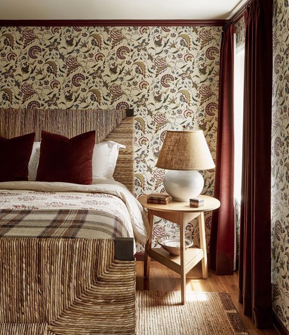
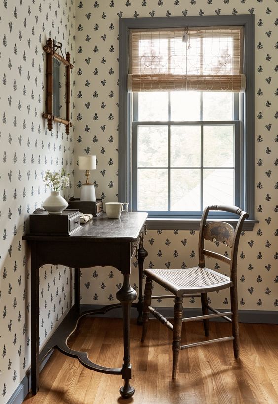
Nobody delivers grandmillennial vibes quite like Becca Casey. I’ve had my eye on her Bedford Colonial project since the first reveal photo and still can’t get over both this bedroom and desk nook. In both cases she went bold contrast, and it totally made the space.
In this example by queen Heidi Caillier, the contrast trim is a continuation of the painted fireplace mantle. The muted green is so subtle in nature but complements the earthy color palette beautifully.
Katie Monkhouse could have easily used white trim in this nursery for a super classic look. But there’s something about the soft gray that makes the space feel fresh and modern in a way white never could. Sometimes you don’t have to go super bold to make a statement.
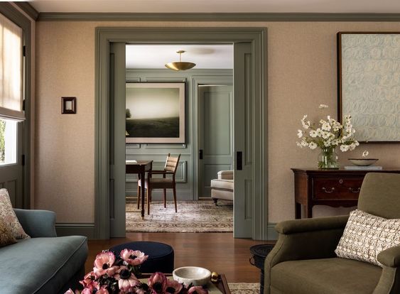
I’ve been very vocal about my love of dark and moody paint colors. Especially when it’s used in a study like this example by Park & Oak. The deep charcoal carries from the wall treatment to the bookcase to the trim and looks absolutely striking yet sophisticated.
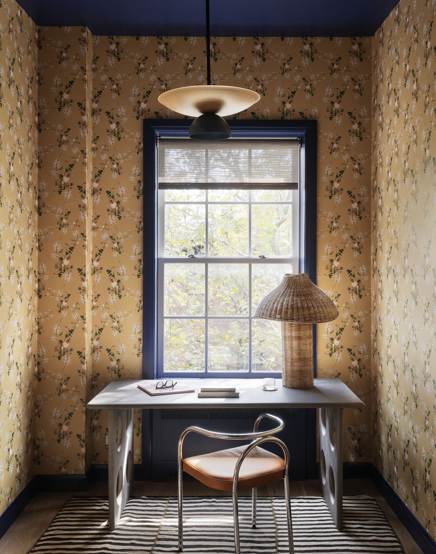
I personally think contrast trim and wallpaper are a winning combination. I love when designers pull out a secondary color tone from the wallpaper for a look that’s complementary but not matchy-matchy. Studio DB understood the assignment and delivered in the latest East Village project.
If you’re ready to try contrast trim on more subtle terms, here’s your point of inspiration. The team at reDesign Home used the most soothing neutral to offset white walls for a bedroom that feels like a total escape. The contrast trim complements the bedding textiles, while the rug and dark wood floors add just the right balance.
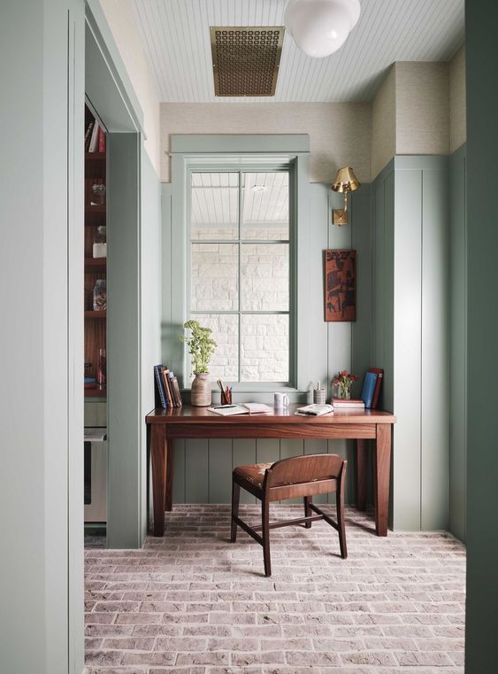
I’m wrapping with another example from Stephanie Sabbe, but who could blame me? This office nook is set just off the kitchen featured above, but with natural light streaming in, the color takes on a whole new look. If you weren’t convinced to try contrast trim before, this will definitely seal the deal.
BY: ANASTASIA CASEY
PREVIOUS POST >